An Image slider or a slideshow (also called carousel), is an animated design element used to display a group of images in a slideshow fashion. As a slideshow, Image Sliders show one image at a time. The content changes when a user interacts with the slider by clicking on a control element usually in the form of arrows or dots.
The Image Slider is usually made to work with a combination of HTML, CSS, and JavaScript coding, but for this one, we'll be creating an Image Slider using only HTML and CSS.
Our image slider/carousel will be composing of five images, the images will use a sliding animation, and can be interacted via dots — our controller.
Here's our HTML code:
<html>
  <head>
    <title>Image Slider</title>
    <meta charset="UTF-8">
    <meta name="viewport" content="width=device-width, initial-scale=1.0" />
    <link href="style.css" type="text/css" rel="stylesheet" />
  </head>
  <body>
    <div class="window">
      <span id="slide-1"></span>
      <span id="slide-2"></span>
      <span id="slide-3"></span>
      <span id="slide-4"></span>
      <span id="slide-5"></span>
      <div class="image-container">
        <img src="a.jpg" class="slide">
        <img src="b.jpg" class="slide">
        <img src="c.jpg" class="slide">
        <img src="d.jpeg" class="slide">
        <img src="e.jpg" class="slide">
      </div>
      <div class="button-container">
	<a href="#slide-1" class="slider-button"></a>
	<a href="#slide-2" class="slider-button"></a>
	<a href="#slide-3" class="slider-button"></a>
	<a href="#slide-4" class="slider-button"></a>
	<a href="#slide-5" class="slider-button"></a>
      </div>
    </div>
  </body>
</html>
Here's the explanation of our HTML code. In line 5, we set our meta viewport to "width=device-width, initial-scale=1.0" so it would automatically scale our window to a smaller window on mobile.
Line 6 links to our CSS file. We will be using this Cascading Stylesheet to pull our sliding animation effect.
Line 10-14 are our slides, we will use them later to move the images.
Line 16-20 are all our images. We contain them in a div container with the class "image-container".
Line 23-27 are the buttons. They are in the form of dots, and they will serve as our interactive controller.
Now for our CSS:
body {
  background-color: #000;
}

.window {
  width: 450px;
  height: 300px;
  margin-left: auto;
  margin-right: auto;
  overflow: hidden;
  text-align: center;
}

.image-container {
  width: 2250px;
  height: 300px;
  position: relative;
  transition: left 2s;
  -webkit-transition: left 2s;
  -moz-transition: left 2s;
  -o-transition: left 2s;
}

.slide {
  float: left;
  margin: 0;
  padding: 0;
}

.button-container {
  top: -20px;
  position: relative;
}

.slider-button {
  display: inline-block;
  height: 10px;
  width: 10px;
  border-radius: 5px;
  background-color: #fff;
}

#slide-1:target ~ .image-container {
  left: 0;
}

#slide-2:target ~ .image-container {
  left: -450px;
}

#slide-3:target ~ .image-container {
  left: -900px;
}

#slide-4:target ~ .image-container {
  left: -1350px;
}

#slide-5:target ~ .image-container {
  left: -1800px;
}
Our CSS is contained in our stylesheet named "style.css". We linked it into our HTML using the link tag in our HTML code above. The CSS will not only be giving our HTML form, but will also be creating our slideshow animation.
Let's focus on the important lines of the CSS code.
Line 5: This is our main div. Our window. Here, we have a fixed width and height. We wanted to center our window so we set our alignment (text-align) to center. The left and right margins are set to automatic, this is needed if we are to center our window. Since this is going to be our window where we are going to view the slides, we have to hide images not within the scope of the window. That way, we'll only be seeing only one image at a time. To do that, we need to set the overflow property to hidden.
Line 14: This is the class for our image container — the container of our images. The width of this container has to be equal to the width of all of our images combined. It is also important that each of our images should match the width and height of our window (450x300). Our image container should also match our window height. This div's position should be relative to our main div, thus position: relative. To enable the effects, we need to make use of the transition property. transition: left here makes our image move to the left and the 2s is the time it will take for the image to complete the movement. This creates the sliding animation. If the time is set to 0, the process would be instantaneous, and if it's not set at all, then there would be no animation. -webkit-transition makes this animation work on browsers that uses Webkit rendering engines, this includes Chrome and Safari. -moz-transition is for Firefox, and -o-transition is for Opera. This ensures that our animation will work on older versions of these browsers.
Line 24: This is our slides' CSS. It's floating left so that images will not push each other downwards. Margin and padding are also set to zero so they don't push the element out of view.
Line 30: This is the container of the navigation buttons. Top -20px makes it position inside the slider, it also bring its contents along with it.
Line 35: This is the class for the navigation buttons — the buttons that control the sliding animation. It is displayed inline-block to make it appear in a horizontal row. Border radius 5px turns it into circles.
Line 43, 47, 51, 55, 59: These are our slides' IDs, which also serves as bookmarks. This is the code that makes the images move. It targets our image container, and based on which #slide number is clicked on the navigation button, it is going to apply a specific left property effect on the container. This causes the images inside the container to move to the left. For instance, if we click #slide-3 navigation button that links to the #slide-3 bookmark, the browser will open our url with the #slide-3 added into it. This will trigger the "#slide-3:target ~ .image-container" CSS instruction that would set the image-container to left: -900px. This will make the third image appear in the window (assuming all the images have the same width of 450px). If no #slide is selected, our slider will show the first picture. Clicking on a #slide while there is no #slide set in the url will instantaneously switch the image container's left property without going through the sliding animation. This is because the browser treats our page's url with the bookmark differently and has reopened our page without triggering the transition effect.
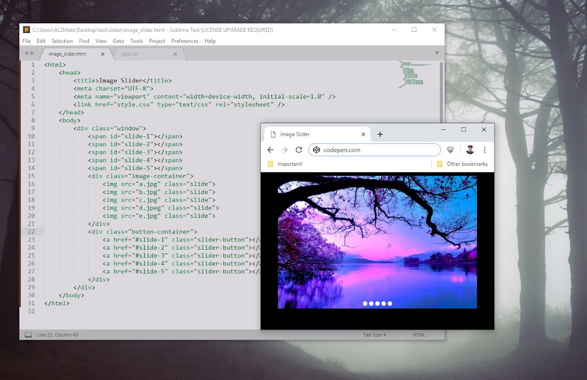
Here's how our code looks like
See the Pen Image Slider with Sliding Animation by AL Meta (@Altometa) on CodePen.
You can download the sample here.